


How to Match Floor Tiles With Wall Tiles: Design Guide
Knowing how to match floor tiles with wall tiles starts with one simple rule: the two surfaces should coordinate without competing for attention. A bold or patterned floor is usually balanced with simpler walls, while a decorative wall can be supported by a neutral floor. Colours do not need to be identical, but their warm or cool undertones should work together.
For practical floor and wall tile combinations, the floor should first be selected according to durability, grip and room use. Wall tiles can then be coordinated through colour, texture, pattern, size or finish. Matt floors with smoother or glossier walls are commonly used because visual contrast can be created without introducing too many colours.
Room size, natural light, grout colour and surrounding furniture should also be considered before matching floor and wall tiles. The aim is not perfect matching. A balanced visual relationship should be created between every surface.
Should Floor Tiles and Wall Tiles Match?
Floor tiles and wall tiles do not have to be exactly the same.
In fact, an effective wall and floor tile design is often created when the surfaces are related rather than duplicated. The same colour family can be used with different finishes, or a darker floor can be paired with a lighter version of the same tone on the walls.
Three approaches are generally useful:
- Match: Similar colours or the same tile appearance can be continued across both surfaces.
- Coordinate: Related colours, patterns or textures can be used without being identical.
- Contrast: One surface can be deliberately made darker, lighter or more decorative.
The approach should be selected according to the room rather than applied throughout the entire home.
Before combinations are shortlisted, separate floor tiles and wall tiles should also be compared according to where they will be installed. A tile selected mainly for a wall should not automatically be assumed to be suitable for flooring.
How to Match Floor Tiles With Wall Tiles: Step-by-Step Guide
1. Start With the Function of the Room
The room should be considered before colour or pattern is selected.
Bathrooms are exposed to water and moisture. Kitchens are affected by grease, spills and regular cleaning. Living rooms usually receive more attention from a visual perspective, while entrance areas may receive heavier foot traffic.
Because these requirements differ, the floor should generally be selected first based on function.
For example, a bathroom floor may require a matt or textured finish for better grip. A kitchen floor should be easy to maintain. Once the functional surface has been chosen, wall tiles can be coordinated with it.
This approach prevents an attractive combination from being selected only to discover that one of the tiles is unsuitable for its intended area.
2. Match Undertones Before Matching Exact Colours
One of the easiest ways to improve tile colour combinations is to look at undertones rather than exact shades.
Warm colours usually include:
- Cream
- Beige
- Sand
- Warm taupe
- Terracotta
- Warm brown
Cool colours commonly include:
- Crisp white
- Cool grey
- Charcoal
- Blue-grey
- Certain greens
A warm beige floor, for example, will usually sit more naturally beside cream or warm-white wall tiles than beside a strongly blue-grey wall.
Similarly, a cool grey floor can be coordinated with white, pale grey or other cool-toned surfaces.
The tiles do not need to have the same colour. They simply need to belong to a palette that feels connected.
3. Decide Which Surface Will Be the Focus
When both floor and wall tiles contain strong patterns, movement or colour, too many focal points can be created.
Instead, one surface should be allowed to lead.
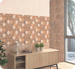
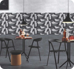
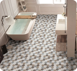
If a patterned floor tile is selected, plain or lightly textured wall tiles can be used. If a decorative feature wall is planned, the floor can be kept relatively simple.
This principle is especially useful when matching tiles for home interiors where furniture, curtains, cabinetry, lighting and artwork will also be added later.
A room does not need every surface to attract attention.
A useful rule is:
Bold floor + quiet wall
or
Quiet floor + bold wall
When both are neutral, differences in texture, finish or size can be used to prevent the room from appearing flat.
4. Create Contrast Through Finish
Colour is not the only way contrast can be introduced.
A matt floor can be combined with a smoother or glossy wall while similar colours are maintained. This allows visual depth to be created without adding another strong shade.
Matt and textured surfaces are often considered for flooring where grip matters. Glossy surfaces are generally more suitable for walls, where reflected light can make an area appear brighter.
For example:
- Matt grey floor + glossy light-grey wall
- Matt beige floor + polished cream wall
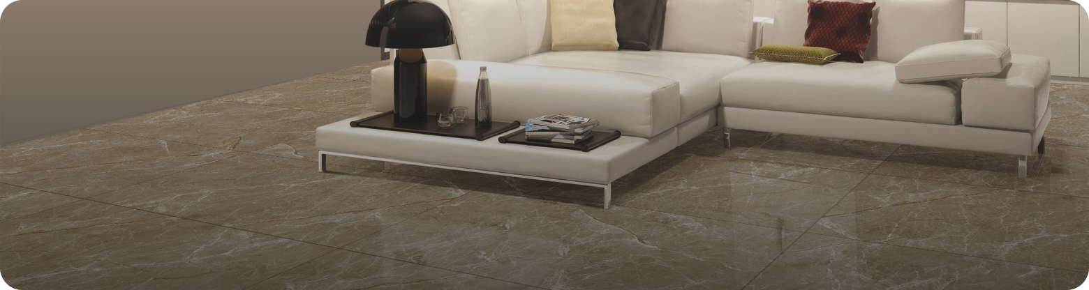
- Stone-look floor + smooth off-white wall
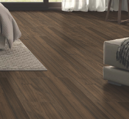
- Wood-look floor + simple warm-white wall
This approach is particularly useful when a minimal colour palette is preferred.
5. Coordinate Tile Size and Layout
Tile scale should also be considered when floor and wall tiles are paired.
Large tiles on both surfaces can create a clean, continuous appearance because fewer grout lines are visible. Alternatively, large floor tiles may be paired with smaller wall tiles to create a controlled difference in scale.
Different layouts can also be used when similar tiles are selected.
For example, wall tiles may be installed vertically while floor tiles are laid in a straight grid. A subway-style wall layout may be placed above a simple large-format floor.
When pattern, colour, finish and layout are all changed at the same time, however, the room can become visually busy.
Usually, one or two differences are enough.
6. Use the Same Tile Look for a Seamless Design
Using a similar tile appearance on floors and walls can make a room feel more continuous.
Marble-look, stone-look, concrete-look or neutral tiles are well suited to this approach because visual continuity can be achieved without relying on strong colour.
This method can be particularly effective in smaller bathrooms because fewer visual breaks are created between vertical and horizontal surfaces.
However, suitability for floor use must always be checked. Even when a wall and floor are intended to look the same, the required floor performance should not be sacrificed simply to achieve continuity.
7. Do Not Forget the Grout Colour
Grout can significantly change how a tile combination is perceived.
When grout is kept close to the tile colour, the tiled surface appears more continuous. When strongly contrasting grout is used, each tile and its layout become more visible.
For example, white tiles with white or pale grout can create a quiet background. The same tiles with dark grout will create a much stronger grid.
If the floor and wall already contain several design elements, subtle grout will usually be easier to coordinate.
If simple tiles have been selected and their shape or layout needs to be highlighted, contrast can be introduced through grout instead.
Best Floor and Wall Tile Combinations for Different Rooms
The same matching rule should not automatically be used in every room. Different surfaces, lighting conditions, and activities need to be considered.
1. Bathroom Floor and Wall Tile Combination
A successful bathroom floor and wall tile combination should balance safety, moisture resistance and visual openness.
Some combinations that work well include:
- Dark grey matt floor + light grey or white wall
- Beige textured floor + cream wall
- Stone-look floor + plain neutral wall
- Light marble-look walls + medium-grey floor
- Neutral floor + one patterned shower or vanity wall
Small bathrooms can benefit from lighter wall tiles because more available light is reflected around the room. A slightly darker floor can then be used to provide definition.
If visual continuity is preferred, similar marble or stone tones can be carried across both surfaces while a more practical finish is retained underfoot.
Bathroom-specific options can be compared through the bathroom floor tiles and bathroom wall tiles collections before a final pairing is made.
2. Kitchen Floor and Wall Tile Combination
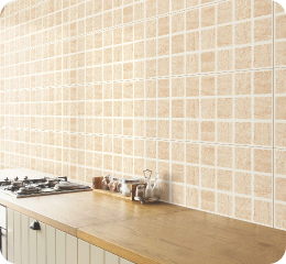
A kitchen floor and wall tile combination needs to work with cabinets, countertops, appliances and the backsplash.
Because several finishes are already present in most kitchens, excessive tile variation should be avoided.
Useful combinations include:
- Grey floor + white backsplash
- Beige floor + cream wall tile
- Stone-look floor + warm neutral backsplash
- Wood-look floor + simple white or beige wall
- Neutral floor + patterned backsplash
If strong veining is already present on a countertop, simple wall tiles can prevent the kitchen from looking crowded.
Likewise, where colourful or patterned backsplash tiles are being used, a quiet floor tile colour combination in grey, beige, taupe or another neutral tone can provide balance.
Separate kitchen floor tiles and kitchen wall tiles can be compared by application when planning the overall kitchen scheme.
3. Wall and Floor Tiles Color Combination for Living Room
A wall and floor tiles color combination for the living room should usually be planned around the floor first because it covers a large area and will influence furniture, rugs, and feature walls.
Some reliable options include:
- Beige floor + cream feature wall
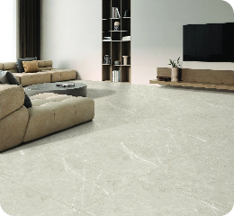
- Light grey floor + white or soft grey wall
- Marble-look floor + restrained stone-look wall
- Wood-look floor + beige or warm-grey wall
- Dark grey floor + lighter neutral wall
Living rooms usually contain more furniture than bathrooms, so visually complex tiles should be used selectively.
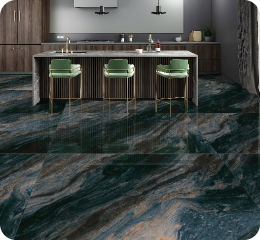
If a dramatic TV wall or feature surface is planned, the floor is generally better kept neutral. If the flooring already contains pronounced marble veins or patterns, a simpler wall can be used.
The available living room floor tiles can also be compared with suitable wall designs before a permanent combination is chosen.
4. Bedroom Floor and Wall Tile Combination
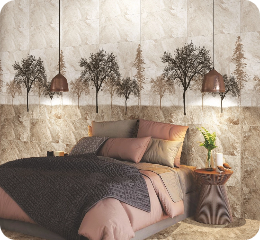
Bedrooms generally benefit from quieter combinations.
Warm neutrals, natural textures and wood-inspired surfaces can be used to create a softer visual environment.
Useful combinations include:
- Wood-look floor + cream wall
- Beige floor + warm white wall
- Soft grey floor + off-white wall
- Light stone-look floor + muted textured feature wall
Very strong contrast across large surfaces may make a bedroom feel more active. If a decorative wall is wanted behind the bed, surrounding surfaces should usually be kept restrained.
Should Floor Tiles Be Darker Than Wall Tiles?
Floor tiles do not have to be darker than wall tiles, but a darker floor with lighter walls is an easy way to create visual balance.
The darker surface can make the room feel grounded while the lighter walls help distribute available light.
However, the opposite can also work. Light flooring may be paired with a darker feature wall in a spacious room where sufficient natural or artificial light is available.
Instead of following a fixed dark-floor rule, room size, light, and intended atmosphere should be considered.
How Many Different Tiles Should Be Used in One Room?
For most rooms, one to three tile designs are enough.
A simple arrangement may include:
- One floor tile
- One main wall tile
- One optional feature or accent tile
When several patterns, finishes and colours are introduced at once, visual continuity becomes harder to maintain.
If three tiles are used, at least one connecting element should usually be repeated. That connection may be colour, undertone, texture or material appearance.
Common Mistakes When Matching Floor and Wall Tiles
1. Choosing Tiles Separately
A floor tile may look attractive on its own, as may a wall tile. That does not mean the two will work together.
Samples should be viewed side by side wherever possible.
2. Mixing Warm and Cool Undertones Accidentally
Warm cream placed beside icy grey can appear mismatched even when both colours are neutral.
Undertones should therefore be compared before exact shade differences are considered.
3. Using Too Many Strong Patterns
A patterned floor, decorative wall, detailed countertop and contrasting grout can all compete for attention.
One dominant surface should usually be selected.
4. Ignoring Natural Light
The same tile can appear different under daylight, warm artificial lighting and cool artificial lighting.
Final combinations should be assessed under lighting similar to that of the finished room.
5. Selecting Floor Tiles Only for Appearance
Floor surfaces must handle traffic, moisture and cleaning according to their location.
When the best tiles in Nepal for a particular home are being compared, suitability for the application should be considered alongside colour and design.
6. Forgetting Furniture and Fixed Finishes
Tiles are not viewed in isolation after a room has been completed.
Cabinetry, countertops, doors, sanitaryware, sofas, rugs and other permanent finishes should be included in the colour palette before final selection.
Why Choose Kajaria Ramesh for Wall and Floor Tiles in Nepal
Kajaria Ramesh offers a wide range of wall and floor tiles for different spaces, including bathrooms, kitchens, living rooms, bedrooms and other residential applications. Different colours, finishes, sizes, and surface designs can be compared based on the function and visual style of each room.
Separate collections for floor tiles and wall tiles also make matching floor and wall tiles easier. Coordinating options can be explored based on colour, finish, pattern and room type rather than selecting both surfaces independently.
For homeowners comparing the best tiles in Nepal, combinations can also be previewed through the Kajaria Tile Visualizer. This allows different floor and wall tile combinations to be considered before the final selection is made.
Conclusion
Learning how to match floor tiles with wall tiles is mainly about creating balance between colour, finish, pattern, scale and room function. The tiles do not need to be identical, but they should share a visual connection through tone, texture or overall design.
Well-planned floor and wall tile combinations can make bathrooms feel more open, kitchens more coordinated, living rooms more balanced and bedrooms more comfortable. By choosing one surface to lead, limiting strong patterns and considering grout, lighting and surrounding finishes, a more cohesive result can be achieved.
Before the final selection is made, samples should be compared together, and the full combination should be viewed in the intended space.
FAQs About Matching Floor and Wall Tiles
1. How do you match floor tiles with wall tiles?
Floor and wall tiles should be matched by coordinating their undertones, colour intensity, texture and visual weight. One surface should usually be selected as the focal point while the other remains simpler. Functional requirements such as floor durability and slip resistance should be considered before appearance.
2. Should floor and wall tiles be the same colour?
No. They can be the same colour, different shades of one colour, or complementary colours. Similar undertones are more important than an exact colour match.
3. Can the same tile be used on floors and walls?
The same tile appearance can be used on both surfaces when the product is technically suitable for floor installation. Wall-only tiles should not automatically be installed on floors because flooring must withstand foot traffic and other performance requirements.
4. What is the best floor and wall tile combination for a small bathroom?
Light wall tiles with a neutral matt floor are a practical option. Similar light tones can also be used on both surfaces to reduce visual breaks and make the room appear more continuous. A single feature area can be added if additional contrast is wanted.
5. Which tile colours make a room look bigger?
White, cream, pale beige, soft grey and other light neutral shades can help a room feel brighter, particularly when sufficient light is reflected from the surfaces. Large-format tiles and restrained grout contrast can also reduce visual interruption.
6. Should the floor be darker than the walls?
It can be, but it is not required. Darker floors with lighter walls create an easy sense of visual grounding. Light floors with darker feature walls can also work in larger or well-lit rooms.
7. Can patterned floor tiles be paired with patterned wall tiles?
They can be, but the patterns should be carefully controlled. In most homes, a patterned floor is easier to balance with a quieter wall, or a patterned feature wall can be combined with a simple floor. Using strong patterns across both large surfaces can make the room feel crowded.
8. What is the easiest way to choose tile colour combinations?
Begin with the floor because functional requirements are usually stricter. Select its main colour and undertone, then choose a wall tile that repeats or complements that undertone. The final pairing should be checked with grout, lighting and other fixed finishes before installation.